eHarmony is in the middle of going through an incredible transformation. I haven’t visited the site in a while, and boy was I surprised when I logged in over the weekend. I’ve been doing a lot of competitor analysis for clients and it’s good to re-login and create new profiles on the top sites every once in a while to see what’s changed. Everything from profile layout to pricing and functionality to profile questions has been thoroughly revamped at eHarmony. Clearly the product team has been paying attention to the competition and testing a lot of new features.
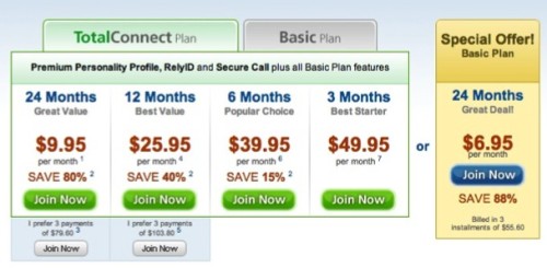
Perhaps I need more coffee, but I am confused about the new eHarmony paywalls. It’s free to communicate but I have to pay $3.95 a month to see people’s photos. Faceless people messaging and responding to each other for free? Then pay up to $50/month to be able to see their faces? When the value proposition is posed like that, feels strange. If any dating startup said that to me, I’d say let’s think long and hard about this decision. But it’s eHarmony, and they are in the middle of a resurrection.
The inexpensive price is probably because the account I logged into is very old. The pricing was $50/month when I logged in again.
Look at that, a 24-month plan. I have never seen this before. That’s kind of sad, isn’t it? Somebody clicking 24-months and letting out a deep sigh. Great for revenue though. Looks like that was a test, I only see 12-month plans now.
When I signed up for the special $3/month prices, the shopping cart says:
You are now an eHarmony member and can begin communicating with your matches.
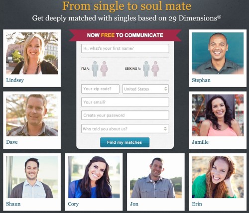
The home page says communicating is free. This is a tiny detail, but it’s the kind of thing I see all the time. Sloppy contextual coding oversight.
The WhatIf feature: They relax your search criteria to bring you more matches that might not be exactly what you *think* you are looking for. Everybody does this already, but eHarmony branded an SQL query and turned it into it’s own feature.
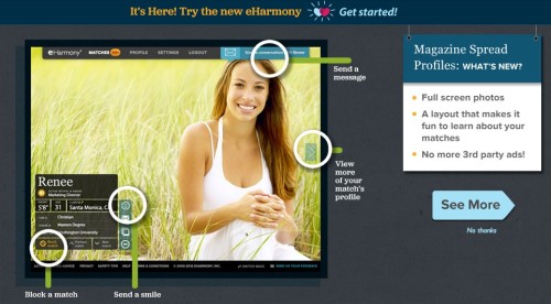
Here’s a look at the new eHarmony “Magazine Spread” layout. Almost feels too over-designed. Big brilliant profiles are great, but the matching remains undifferentiated from Match or POF or OkCupid, at least from my perspective. Favorite pets, sports teams, food books, whatever. These datapoints are far less important than things like energetic compatibility and other more modern matching attributes.
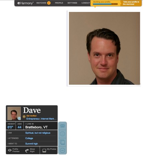
Looking at Eharmony profiles now take 4-clicks to fully navigate. Feels like pages are pre-fetched which is makes it feel fast. Profile home page is a big and empty, looks terrible until they get people uploading large Facebook profile photo-sized giant photos. The system rejected my Grumpy Cat photo. Not sure if that was machine-based or some $2/hour person in the Philippines that caught it quickly.
There is so much going on here. Like most changes to sites, maybe this will grow on people. Feels really crowded and awkward and needs a lot more UX work. Things I can’t live without, might as well put a shout-out to OkCupid there.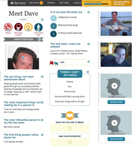
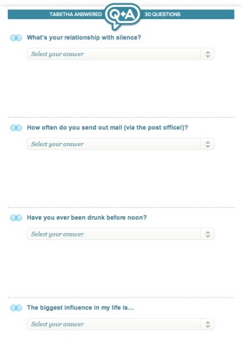
Looks like they got some inspiration from OkCupid here as well. I wonder if/how the “I love to get hammered before noon” datapoint worked into the 29 dimensions of compatibility.
It’s going to take a few days to get used to this layout. I’m kind of bummed to see EH jump on the “Let’s ask a ton of questions” bandwagon. The Q&A section is seriously broken right now, which is surprising given the systems EH has in place to manage millions of users. If it leads to better matches, great. If not, it’s just more stuff to be badgered to fill out just like on every other site.
In closing, I wonder how readers perceive eHarmony as being different from Match besides the fact that eHarmony emails you your matches and there is no search functionality.
Do people prefer to have matches emailed to them and no search, or do you like to go crazy with the advanced search to pinpoint your matches?
Is the dating world splitting up into people who prefer one method of matching over another?
