Logged into OkCupid and realized I had a ton of emails sitting in my inbox, oops. I spent and hour cleaning out my inbox and writing emails, here are a few screenshots and some commentary.

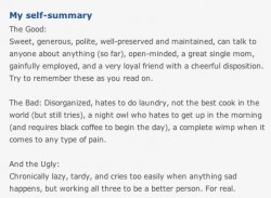
This is fantastic, I love that this woman explained The Good, The Bad and the Ugly about her. Really, most guys could care less about how much women like to travel or how nice and kind she is, thats all subjective and usually off-base anyways.
People fill their profiles with way too much superficial crap that nobody cares about. Give me the Good, The Bad and the Ugly anytime. Related: Exposing Fatal Flaws.
One woman was unable to muster up enough strength to type more than “very good looking,” which, while pleasant to receive, immediately put her in the “don’t bother” category. However, I responded that I wasn’t interested and tried to help her understand where she missed the mark. These emails make it way too easy to hit the delete key.
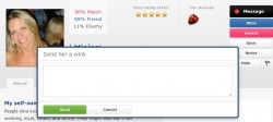
 OkCupid has been making a lot of changes lately. This is an older feature but I love that you have to send at least 50 characters with a wink.
The whole “show interest” thing that most sites do is generally a crap-tastic feature. Either provide some depth and context to a reach-out, or skip it. I’m sure woman love that men have to say at least a little something to send winks on OkCupid, wonder what the most common phrases are.
 This is a classic. Underneath a wink from a person who doesn’t exist on the site anymore we find an ad for a story on The Daily Beast about dating people on Twitter. Its clearly an ad, but links to a blog post and it’s a negative ad overall. I bet it gets clicked on a *lot*.
A Guide to Writing the Most Generic OkCupid Profile Ever. Spot on.
See How OK Cupid’s Amazingly Sarcastic Customer Service Policy Devolved Into A User Threatening Violence. I’ve seen many emails to top dating site customer service departments, this one is pretty generic IMHO. Single people tend to have big chips on their shoulders if they feel they are not being treated like kings and queens and customer service has to deal with it, every day, all day. Not an enviable job.
 One last screenshot, this one is of the new chat bar the sits at the top of the browser window and follows as you scroll down while viewing someone’s photos. Love it! Give people more chances to interact.
This useful feature is yet another reason why measuring site popularity via pageviews and visitors is broken and needs to evolve. Plus the fact that much ad/incentive/affiliate dating site traffic are people who hit the landing page and bounce, effectively adding zero benefit to the sites popularity.
The idea of visiting a new “page” to email someone is quaint. Most websites could be a single page that evolves over the duration of the visit. We can thank Facebook for this. Actually, there will be no “web pages” on the Internet in a few years, but that is a story for another time.

