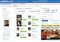
 Over the past month or two Match has been rolling out a number of design and functionality updates. To begin with, the familiar black header has been replaced with a blue one. Match has thrown out any sort of cohesive design pattern, everything looks like it’s being modularized, perhaps to make it easier to work with third-parties like MSN.
The Connections page has been redone. Now we can see less of our “dashboard” view than before. Main view has been reduced to two columns, pretty much the same functionality, I thought the way was fine.
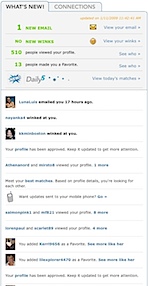 Once you breath a sigh of relief over the loss of the black graphics, clicking on the What’s New tab is where things start to get interesting. Match has found inspiration in Facebook’s Wall and built one of their own by reformatting the content from your Connections tab and turning it into a wall, or lifestream. As far as I can tell your wall displays who has emailed, winked and viewed your profile, as well as that your and your favorite’s profiles have been updated as well as who I have added as a favorite.
The profile update note is a half-measure which should display something about what was changed, which is much more interesting. It’s all about driving engagement and pageviews, best to tease people into clicking.
Match was smart to insert items like “Want updates sent to your mobile phone?” with a link to pay them $4.99 to get emails on the go. Who pays for that?
Another item is a call to action to “Meet your best matches. Based on profile details, you’re looking for each other.”
What happens in six months when the Wall feature is not new anymore? I’d like to make the Wall my default view. And why can’t I drag-n-drop Connections in the order I want?
Match has always done a lackluster job of explaining how their site works and what’s changed. I guess they feel that they can expose people to features and functionality and make a few bucks (albeit on features that I don’t feel are worth charging for) at the same time.
 All social networking make their walls accessible as an RSS feed. I’m sure Match has concerns about average folks figuring out how to read the feed and third parties doing nefarious things with your private data. Still, as a power user, give me the tools I need to use Match the way I want to use it instead of the watered-down, generic please-everyone features they have to offer middle America. Just don’t make it as complicated as Facebook.
I for one hope the overlords at Match will create a dating application for my iPhone. I would pay $4.99 for that in a heartbeat. Build the flirting app on top of Viximo’s new development platform, sweet.
The ads continue to be un-targeted junk. K&B Toys and Olive Garden? Sigh. Where’s the targeted ads coming from IAC’s new uber-ad platform? Ads are obviously low on the list of priorities.
I like that they have added a note at the bottom of the page that the privacy policy was updated on November 5. Where they fail is that they do not list what changed at the top of the privacy policy.
You can compare dating sites, Match vs. eHarmony and Yahoo Personals. A generic feature matrix based on three-year old data. Absolutely useless. How about comparing how many people are in your area-code?
 The other feature addition worth mentioning is the Daily5, which is another way to put people in front of you that Match thinks are a good match for you. This is just like OKCupid’s Quiver. They relax your search criteria constraints by a few years and 50 miles or so. I’ve written about this a lot.
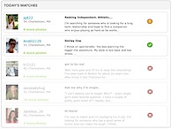 Results are all over the map, some people love it, others are getting people 200 miles away and 10 years older. Match says they will continue to improve it. I hope they do.
Next up, my conversation with Mandy Ginsberg, General Manager of Match North America.

