It’s been a few months since the migration from SpringStreet to FastCupid and time to see how the new site is functioning.
FriendFinder and FC have always been among the first to roll out features way before any other sites. They were among the first to offer profile editing services, background checks, blogs and user groups. The problem is that we’re at Web2.0 and they’re still in Windows 3.1. They have all the prerequisite features any self-respecting dating site should have, but man is it kludgy.
Instant Messenger Beta- Beta is right. When I go to get my ConfirmID to earn points for video-chatting (great idea), the entire FastCupid network is not an option. If you’re going to offer what I assume is some sort of background check service, offer it.
FastCupid’s videochat does not like my Mac or Firefox. It’s a mall percentage of the browser market but it’s Flash and should be fine in all browsers. Has crashed on me at least 10 times, need to be very careful what you’re clicking on, overwhelm it and poof, the browser crashes. For some reason my cam doesn’t show up even though people tell me it says I’m broadcasting. This could be my setup, as I have 3 different video-conferencing app that I use that probably don’t give up the video-stream easily enough to other apps.
The main window interface is not very intuitive. How am I supposed to know that I need to send a “page” to someone, and if they accept a new chat window will pop up?
It automatically filters based on what I think are my search preferences? Why not show everyone then let people filter themselves? I spent a few minutes wondering where the heck everyone was.
This is what you see in the new window when you “page” someone.
Get used to seeing this, a separate window pops up for each user, even if you are sending them a page to see if they want to chat. How about a tab with all our outgoing requests next to the incoming pages tab? Needs a time-out function too, otherwise it just spins around forever. How about option to send them a msg to their inbox?
Windows jump all over the place for no reason. What’s up with that?
I know it’s used by a lot of players, but Flash video, even on the highest setting, is not very good. People will argue about this, go right ahead. I am not a real-time video encoding expert, the simple reality is that standalone video-chat applications have much better quality. H.264 is heavy to encode but looks the best, Flash uses some sort of Sorenson Spark or On2, just make it look less grainy.
Overall, not ready for prime time.
There is also somethings called IMC, which turns out to be a small window to send brief (25 character) messages. Enough text to say “You look like a cool pers.”
I’ve been adding people to my social network at FC. Here’s the response page when I send an invitation:
Not very helpful.
Overall, impressive demographic (personal opinion) but the site is still ugly and needs a thorough user interface designer to give it a facelift. Most telling is that I’ll put up with all the problems because I value the network highly.
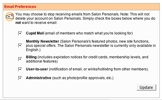
Update: I always wondered why I wasn’t receiving notifications when people had contacted me on the site. Here’s why:
Unlike every other website in the world, they want you to check the boxes of the communication features you do not want instead of opting in by selecting only what you do want. Unintuitive.
3-6-06: Lately I’ve been seeing FriendFinder and Adult FriendFinder ads in the form of banner ads. It looks like they read an advertising network cookie on your hard drive, then display profile pics of people in your area. Smart.
Technorati Tags: fastcupid


