 Most people would agree that online dating advertising leaves a lot to be desired. Except for a few instances like Match and even eHarmony’s latest ads, 18 year-olds co-ed boobs is about as creative as the industry gets. I uploaded some of the first paid banner ads ever and worked for the ad agency that was responsible for Microsoft’s online advertising back in the day so I know a few things about advertising, and what I see is nowhere near living up to expectations.
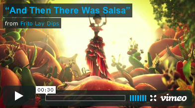
For those dating sites stuck in the stock-photo boobs rut, I wanted to give you some inspiration so you would perhaps stop embarrassing all of us. I present exhibit A: “And Then There Was Salsa”. This is a fanstic example of what can be done with a page takeover. Basing the ad on video makes it even more impressive. Here’s a great NYT Apple ad as well.
Dating sites can attract a lot more people if they would treat members like humans and not sex-crazed hedonists.

