Who knows when OkTrends will post again (it’s been almost two years). In the meantime, I’d love to see dating sites do yearly reviews like this one from email service provider Mailchimp. I saw a lot of fascinating charts and graphs about dating site user behavior at Online Dating Summit, from mobile logins to messages sent and daily logins along with many of other KPI’s (key performance indicators).
Mailchimp does a fantastic job displaying their stats, from number of new customers to emails sent and internal fun stuff like Pizzanomics (number of pizza’s ordered). I’m also a big fan of how each section fades in as you scroll down the page, which is going to be it’s own trend in 2013. It’s amazing what a little CSS can do to prettify ho-hum statistics.
Dating sites, why aren’t you doing this kind of thing? Especially the top sites, who can easily afford to throw a designer and developer at this kind of task.
Someday the dating industry will understand that transparency is a good thing. Users love it, the media loves it, and it can drive lot’s of new business. Just ask OkCupid.
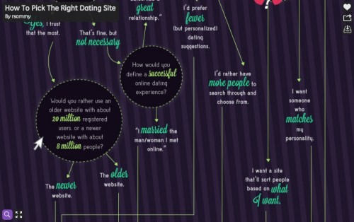
Here is a another example. Click through to see the zoomable image.
I saw one recently where member communication was displayed in real time on an animated map. Forget where I found it. Let me know if you have seen anything else like this.


