 Eye-tracking studies and neuromarketing has always fascinated me. Just last week I was looking at the Emotiv EEG headset (me want!), which is getting into reading brainwaves and eye-tracking at the same time, which excited me to no end.
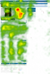
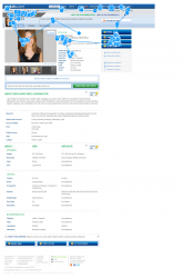
Why should the dating industry care? Today we see that Tobii Technology and AnswerLab announcing the results of an eye-tracking study showing that men spend 65 percent more time reviewing photos in online dating profiles than women do. Alternatively, women spend 50 percent more time than men reading profile information about their prospective partner’s background and interests.
The study included 39 participants, 18 female and 21 male, who each were interviewed before and after viewing dating profiles on both Match and eHarmony. From the gaze patterns collected, it was discovered that male subjects spend 65 percent more time viewing their potential partner’s photo and 50 percent less time analyzing the profile overall, when compared with the gaze data of female subjects.
40 participants in a random cafe in San Francisco is hardly a scientific study, but I believe the results jive with another eye-tracking study from a few years ago. Most of the results are common sense/knowledge, but its always good to add additional information to the pile.
Women spent an average of 84 seconds evaluating a profile to assess if it was a match, while men spent an average of 58 seconds.
Men tend to focus on the profile photo.
In some instances, men spent as much as 65 percent more of their time than women looking at the profile photos.
There is also some good information for dating sites to consider.
A profile that showcased personality at the top of the page was perceived as more personal.
A profile that prominently displayed a list of traits was perceived as more businesslike.
I like that Tobii gave out some free advice for dating sites. This is mostly 101-level User Interface/User Experience stuff but good to remember. Far too many dating sites have awfully-designed templates that often do nothing to improve conversions (People Media comes to mind, but at least a few of their sites seem to be improving and looking better).
Implement a streamlined navigation: Avoid too many calls-to-action in the top navigation that can confuse users and distract them from the main profile and its key interactive elements.
Highlight key profile information: Reduce clutter and streamline key profile information (name, location, etc.) to make it easily discoverable.
Carefully weigh your monetization strategies with the user experience: Minimize the disruptions your advertising and subscription models have upon profile viewing. Assess the placement, frequency and style of ads or up-sells to reduce distractions and enhance effectiveness.
If you want to try eye-tracking on your site, contact Tobii. Another thing to check out is Clicktale, which monitores where the mouse is on a web page. There are plenty of smaller open-source options like Text2.0 thing that does eye tracking right in the browser.
One can hope that these new technologies will supplant the old “stick people in a room and videotape them looking at your dating site” way that everyone from Match to eHarmony has been doing for years.
After all, A/B testing is smart, multivariate testing is complicated and amazingly powerful (you can also shoot yourself in the foot), but plugging people’s brains and eyes into your laptop and finding out what works best for your dating site, thats just awesome.
Most sites just want to increase conversions, but knowing why one design tests better than another is the next frontier for online marketing, opening up a whole new world of possibilities for keeping that sales funnel as slippery as possible.
If this is the least bit interesting, check out neuromarketing as well, a fascinating rabbit hole to dive into for a few hours.


